- The Blueprint Show
- Season 1
- Episode 32
How Zaha Hadid Revolutionized The Way Architects Design
Released on 04/03/2025
Zaha Hadid's buildings are complex, surprising,
and entirely unique,
and it turns out so is her process for designing them.
I'm Michael Wyetzner, I'm an architect,
and today we're going to discover
how Zaha Hadid designs a building
and what makes her process so revolutionary.
[ethereal music]
Zaha Hadid is famous for breathtaking designs
that seem to defy logic and sometimes even gravity.
But while her buildings are undoubtedly eye-catching,
unprecedented, and complex,
it's not the buildings themselves
that are the most revolutionary thing about her legacy.
In fact, it was how she went about designing the building
that changed the way we think about architecture.
So let's talk about her design process,
beginning with the project that inspired her
to rethink what was possible.
This is called Malevich's Tektonik
and Zaha Hadid painted it as part of her fourth year thesis
at the Architectural Association in London.
Her teachers at the time, Rem Koolhaas and Elia Zenghelis,
challenged their students
to use the revolutionary painter Malevich's work
as the basis for a project proposal.
The assignment would profoundly change Zaha
and the way she thought about architecture.
To understand why, let's back up and talk
about what made Malevich revolutionary as a painter.
Broadly speaking, there are two types of art:
objective and non-objective.
Objective art is representational.
A chair looks like a chair. A flower looks like a flower.
It is showing us recognizable things in a recognizable way.
Even cubism falls into this category.
A distorted face still reads as a face,
It never becomes truly abstract.
Non-objective art by contrast,
it's not representational at all.
It is abstract.
It is an exercise in pure expression by the artist.
And at the time that Malevich was working,
abstract art was a brand new idea.
He was at the forefront of developing the entire concept
of non-objective art
in a movement that he called Suprematism.
The name comes from the idea that his art was concerned
with the supremacy of pure feeling
as opposed to the representation of the real world,
which is basically what art was up until that point.
And to support this focus on feeling,
his art was characterized by simple geometric shapes
and a limited color palette
and rejected realistic representation entirely.
So how does this relate to Zaha's thesis project?
In her own words, she was inspired by Malevich's art
to rethink design.
She said Art used to be re-presentation
rather than creation.
Abstraction opened the possibility of unfettered invention.
She also said, I felt limited by the poverty
of the traditional system of drawing in architecture
and was searching for a new means of representation.
So she began to experiment
with abstraction inspired by Malevich's art.
So Malevich created these sculptural objects
he called arkhitektons.
which were essentially these 3D objects
that took his ideas of shapes that he used in his paintings
and turned them into a 3D piece.
The assignment that Koolhaas
and Zenghelis gave their students
was to use this arkhitekton
as the basis for a design for a real-world building.
So let's look at this painting that she has created.
So this painting is intended to read as a presentation
of a hotel and apartment complex
built across Hungerford Bridge in London.
This is far from a typical rendering of a building.
For one thing, it's abstracted.
It mixes perspectives of two dimensions
and three dimensions.
Like Malevich, it uses very simple geometric shapes.
So you see it in 3D over here.
You see silhouettes of it over here,
and they're flying by creating movement.
It's almost as if someone threw it
and it's just hurling through space.
And my favorite part of this is she takes all these pieces,
which sort of is exactly what Malevich was doing.
So if we look at Malevich's
Suprematist Composition 1915,
what you see in this painting are these three
very strong black shapes
floating on essentially a blank white background.
And then under that are these floating array
of red rectangles, lines, and squares.
And you could see how those shapes here
become these shapes here,
and these shapes become the arkhitekton.
And then she's taking that one step further,
and according to her assignment,
is taking that arkhitekton
and is turning it into a building.
Zaha Hadid has spoken
of how this project opened up new ways of thinking for her.
But this was only the beginning for Zaha,
who would continued to explore this process
throughout her career.
One of the first projects that she became known for
was her winning entry for The Peak,
an architectural competition for a private club
at the top of a mountain in Kowloon Hong Kong.
So this is a painting she composed
for part of her award-winning entry into this competition.
And what I love about this painting
is that she shows the whole city and then the mountain
and buildings off in the distance.
And then the very top, there's her project, The Peak,
near the peak of this mountain.
So essentially what she's showing is not only her project
in relation to the rest of the city,
which is very much like the Malevich idea
of showing the shapes in relation to one another,
but she's also showing that her idea
for the building grows out of the mountain.
It almost looks like it's part of the mountain.
[mellow music]
And these are some of the paintings
and drawings she did as part of the design process.
So I love these drawings
because they're half plan, half painting,
and they almost have a feel of Arabic script writing
as part of them.
Quite often she would begin the idea for a project
with these calligraphic drawings,
these sort of pieces of calligraphy and form.
And then she would move from there into painting
to further refine the idea,
and it would evolve eventually into a building.
So this project was never built,
but she used a lot of these ideas in later projects,
and you could see how those sketches
we were just looking at before evolve into the building.
So looking at this,
you could see ideas that Malevich had here,
but unlike Malevich, whose forms never really overlapped,
this is more reminiscent of El Lissitzky
who was Malevich's protege in a lot of ways.
For El Lissitzky, the idea
of expressing personal emotions through art was not enough.
So he aligned himself
with a movement known as Constructivism,
which was based in Russia,
and founded by Vladimir Tatlin and Alexander Rodchenko.
While Suprematism viewed art
as a spiritual and emotional experience,
Constructivism saw it as a tool for social progress.
El Lissitzky even wrote a children's book
called About 2 Squares,
which used the artistic language of Suprematism
to question the societal order of the day,
and which is still considered
an important work in graphic design.
Constructivism took the floating compositions of Malevich
and joined the geometric shapes together
in a way that could be used
as a basis for functional design.
This meant that the art of the Constructivist movement
could have practical applications in architecture.
But the concept he explored
that would prove most influential to Zaha Hadid
was the idea of the fourth dimension.
Einstein at this time was a great inspiration for many,
and he had been exploring the idea of the fourth dimension.
Essentially, if one dimension is a line,
and two dimensions is a plane,
and three dimensions is a cube,
then the fourth dimension adds the element of time.
And essentially, architecture always has had the element
of time embedded in it 'cause we move through it
and once there's movement, there's time.
In its most famous works, Prouns, which is an acronym
for Project for the Affirmation of the New in Russian,
El Lissitzky wanted to create a visual illusion
that would transcend the flat surface,
attempting to imply this unseen dimension of time
that was beyond human perception.
To achieve this, he used several artistic techniques,
which later also appear in the designs of Zaha Hadid,
floating geometric forms, multiple vanishing points,
dynamic perspectives and overlapping planes,
which at times appear to defy gravity.
You can see this idea of the fourth dimension
beginning to come into play in Zaha's architecture
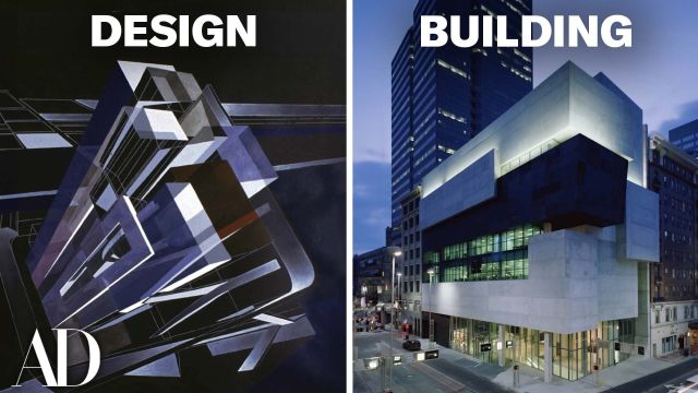
with the MAXXI Museum in Rome.
So this is the MAXXI Museum.
You could see from this overhead
that that idea of calligraphy
is still very much present in the design of this project.
These forms almost feel like some form of writing.
So when you compare this to her original sketches
for the museum, which you see here,
you get the idea of this sort of movement,
which she then intends for people
to move through her museum.
But to really get a sense of the movement of her buildings,
you need to look at them from the interior.
So this is a view inside the MAXXI Museum.
So how does one express four dimensions?
How does one express the element of time within a building?
So Zaha had this idea that she spoke about
that she wants people
to experience the interiors of her buildings
through the idea of these choices that we make.
So she offers different paths through the same space
with the idea that, depending on the path you pick,
it affects the way you'll experience the building.
And I think one could say
that's her expression of the fourth dimension,
the way you move through the building,
the element of time,
is very much part of how she looked at design.
So just like the way you really can't see
the end of the space
or the beginning of the space in this photograph,
it's almost like the way one experiences time
that you can't see the end, the beginning's very hazing,
and you wind your way through the space.
So let's just talk about this interior for a second.
So this red line and these black forms
that are the stairway and the upper walkway,
they are in direct contrast to the surrounding white walls
and gray of the concrete and the white floor.
So it creates this Constructivist Supremacist composition.
And then she expresses the movement of the ceiling above
with these fins, these parallel fins, these baffles,
and those move with the shape of the building
as you wind your way through.
So another idea that Zaha explored was the idea
that all representational drawing is an illusion,
and that includes the way we draw buildings
and the way that they're depicted on the page.
One of the most fundamental ideas in art is representation.
How do we draw or paint something in two dimensions
in a way that best resembles what we see with our eyes?
And one of the main inventions of representational art
is what's known as perspectival drawing or perspective.
Ancient civilizations like the Greeks and Romans
used rudimentary techniques to create depth in their art.
However, it was during the Italian Renaissance
in the 15th century that linear perspective
was formally developed and codified.
Filippo Brunelleschi, an architect, is credited
with pioneering the mathematical principles of perspective.
His methods were then refined later
by artists like Leon Battista Alberti,
who wrote De Pictura in 1435,
a treatise outlining the rules of perspective in art.
So let's get technical for a second,
but in a very rudimentary way.
If one were drawing a simple one-point perspective,
you start with a horizon line,
then you pick a vanishing point,
and then if you are gonna draw a frame,
draw the parallel lines,
converge at that vanishing point, which is this.
And so a person would be standing right here,
and we've basically just drawn a room, right?
And here's a person standing in the room in silhouette.
That's the real basics of what a one-point perspective is.
So all those lines converge to this vanishing point,
but this is an illusion, right?
In essence, what I've really drawn is four trapezoids,
and here's one of 'em.
It's actually a shape.
It appears like it's going off into space,
but it's not 'cause it's on the page.
So it's an illusion what we've drawn.
It creates the illusion of depth.
Then there's two-point perspective.
Two-point perspective takes that same idea
with a horizon line,
but it introduces two vanishing points,
so that if you had a cube,
they go back to that vanishing point
the same way.
And again, that appears to be a three-dimensional object,
but in fact, one could just look at it
as two trapezoids touching one another.
That's perspective in a very, very simplified way.
Then there's these other types
of three-dimensional drawing in architecture.
One is called axonometric, one is called isometric.
Axonometric takes a square like that,
and then projects lines.
And that also reads like a three-dimensional object.
So what this does is it takes an exact representation
of what's drawn in the plan,
the exact dimensions and the exact shape,
and then it just projects lines
to make it look three dimensional.
Then an isometric takes that same piece in the plan
and makes it illusionistic.
So really what's happening is,
this is a true 90-degree angle, right?
But in isometric, it's a false angle.
This is actually drawn at 120 degrees and 30 degrees.
But in our mind, we read this as a 90-degree angle.
So the axonometric drawing takes the actual 90-degree shape
and then projects.
The isometric adds illusion to that top plane.
So the top square looks as if it's been rotated,
but we still read it as a square.
In fact, we read all three sides as a square
to make this cube.
But in reality, it's just a hexagon
divided into three rhombuses.
It's an illusion.
And so in addition to artistic renderings
of a completed buildings, which use perspective
to depict what the building will look like,
architects also draw plans, sections,
and elevations with no three-dimensional representation,
which builders use to construct the building.
But Zaha liked to play with this idea a little.
She would take these distorted shapes
that one sees in an isometric, for instance,
and she would put those into her plans.
So the shapes that make up the illusions of a cube,
for instance, would actually become the shapes
that make up her plans and elevations.
And a good example of this are the plans she devised
for the BMW Center in Germany.
This is the floor plan of the building.
This is actually what the builders will build from.
But at the same time, what Zaha has done,
which I find to be really clever
and cheeky at the same time, is she's injected the illusion
of 3D into the two-dimensional drawing.
So this appears to be a square that we're looking at
as a three-dimensional object, but it's not.
It's just a rhombus.
So she's taken that shape, which is a rhombus,
and she's using it as
the shape of a room here in this plan.
So if we spin the plan around,
we can draw this same exact piece
that we just were looking at before.
So right there, that's an example
of what she was depicting in her plan,
which is a radical idea.
So in effect, she's taking an illusion and making it real.
And so when you're in it, it feels distorted
because these walls are not at right angles to each other.
She's injecting this three-dimensional illusion
into this two-dimensional drawing,
and then it becomes a three-dimensional space.
So another example of how she plays with distortion
is at her first built project,
which is the Vitra Fire Station in Germany.
So her idea for this building
was all about sort of frozen action.
And her idea, because it was a fire station,
that at any moment the building would spring into action
and it would be this explosion of movement.
And so what she does is she takes these shapes
like this one, which or could read as a rectangle
that's been distorted
because a light was projected against it,
and the this would be the shadow
that would be revealed from that projection.
And then she builds that shape.
And all the walls and everything in this building,
very few things are actually at right angles.
The walls are canted, the canopy is slanting up,
the edge of the wall is cut at a slant.
And again, all to reinforce this idea
of an explosion of movement.
But when one looks at these shapes
from a different point of view,
like you do here,
all of a sudden it's completely different.
This is such a great contrast
because this shape is this shape.
It's the same exact canopy.
So it's really this brilliant sort of play
on shape and form
that was, up until this point, not really explored.
And she created this whole idea through the idea of drawing
and painting and creating these different ways
of looking at buildings and designing them.
So by combining an artistic sensibility to representation
and an abstraction of the design process itself,
Zaha was able to make some of the world's most unique
and breathtaking buildings,
of which we've only looked at very, very few.
So I love the way that she combined
this idea of art and architecture
and created something completely different
and something completely new.
And she did an amazing amount
of these fantastic paintings in her earlier years
that are really great works of art.
She passed away way too soon in 2016,
but she set herself apart as an artist
and an architect that truly believed in the power of design
to create spaces which could improve the lives
and experiences of anyone who came in contact with them.
So what's your favorite Zaha Hadid building?
Let us know in the comments below.

Architect Breaks Down 5 Typical New York Apartments
Architect Breaks Down Details of “The Grand Budapest Hotel"

Architect Breaks Down “Bridgerton” Mansions

Architect Breaks Down 6 Luxury Apartments from Billions, Gossip Girl & More

Hidden Design Details in Mad Men, That ’70s Show & More

Architectural Expert Breaks Down Disney Castle Details

Architect Breaks Down Baseball Stadium Details (Past & Present)

Expert Breaks Down Hogwarts Architectural Details

Architect Breaks Down the Evolution Of Batman’s Wayne Manor

Architect Breaks Down 5 Haunted Houses From Scary Films

Expert Breaks Down Wakanda's Architecture In 'Black Panther'

Why The Chrysler Building is a New York City Icon

Architect Breaks Down NYC Subway Stations (Oldest & Newest)

Expert Compares Star Wars Locations To Their Real-Life Inspiration

Architect Breaks Down Movie Theater Evolution, From Palaces to Multiplexes
Architect Breaks Down 5 of the Most Common Skyscraper Styles In New York
Architect Breaks Down 3 Demolished New York Landmarks

Architect Breaks Down the Designs Of 5 Iconic Movie Bars

Architect Breaks Down 5 of the Most Common Houses in L.A.

Architect Breaks Down Why All American Diners Look Like That

Barbie Historian Breaks Down The Dreamhouse Evolution (1962-Now)

Why New York City Wouldn’t Exist Without These 5 Bridges

How Iconic Disney Castle Interiors Were Inspired By The Real-World

Architect Breaks Down Why Movie Villains Live In Ultra-Modern Houses

Why 4 New York Museums Were Designed So Differently

How 'Dune' Replicated Real-Life Ancient Architecture

Architect Breaks Down the Most Common Styles of College Campus
The Secret to Good Airport Design: Aesthetic vs Efficiency

Francis Ford Coppola Breaks Down The Design of ‘Megalopolis’

How ‘Wicked’ Built Immersive Real-Life Sets, From Shiz To Emerald City
Why Prefab Architecture Could Be the Future – But Probably Won’t Be
How Zaha Hadid Revolutionized The Way Architects Design